Bringing a brand new Indian craft gin to life.
Bringing together the expertise of four generations of agricultural and distilling heritage, with carefully selected Indian botanicals and the Spirit of Craft, the Swarup family have created an India Dry Gin of true provenance. We were invited to create a brand language, visual design and packaging that reflects this confident, authentic spirit, by being crafted with as much care and honest clarity as the liquid.
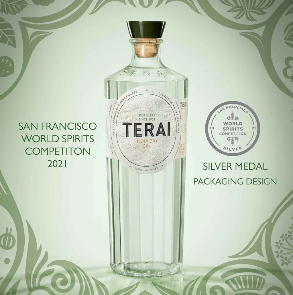
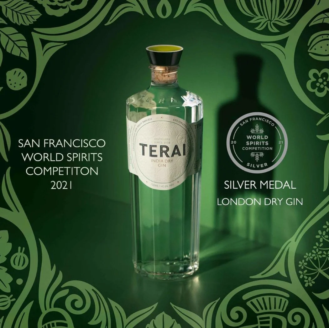
Terai won Silver Medals at the prestigious San Francisco World Gin Competition 2021, in both, the London Dry Gin and Packaging Design categories.
Creative Direction
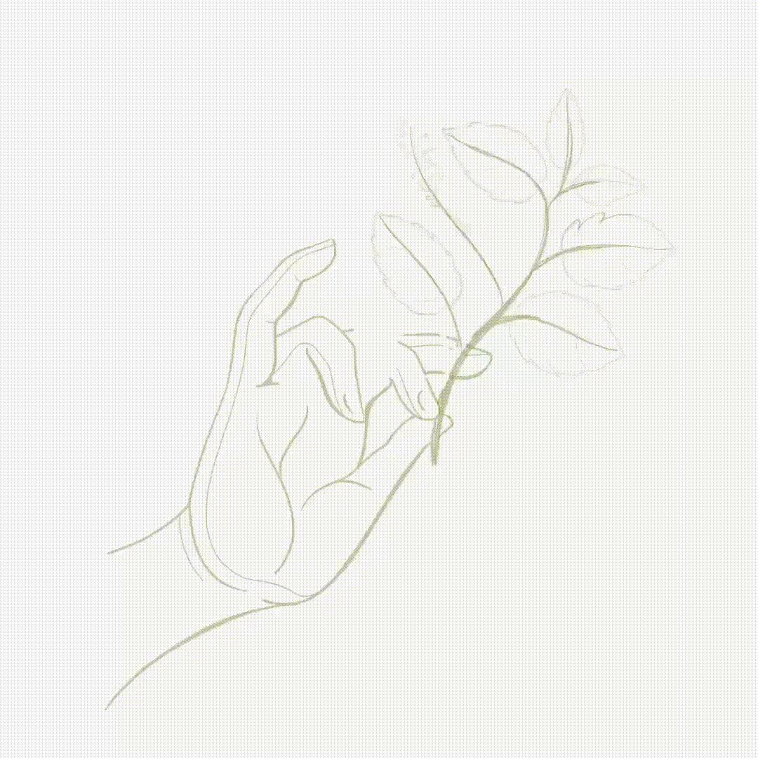
Illustrations
Bottle Design
Label Design and Production coordination
Closure Design using an Indian craft
Distillery Exhibition Design
Installation Design


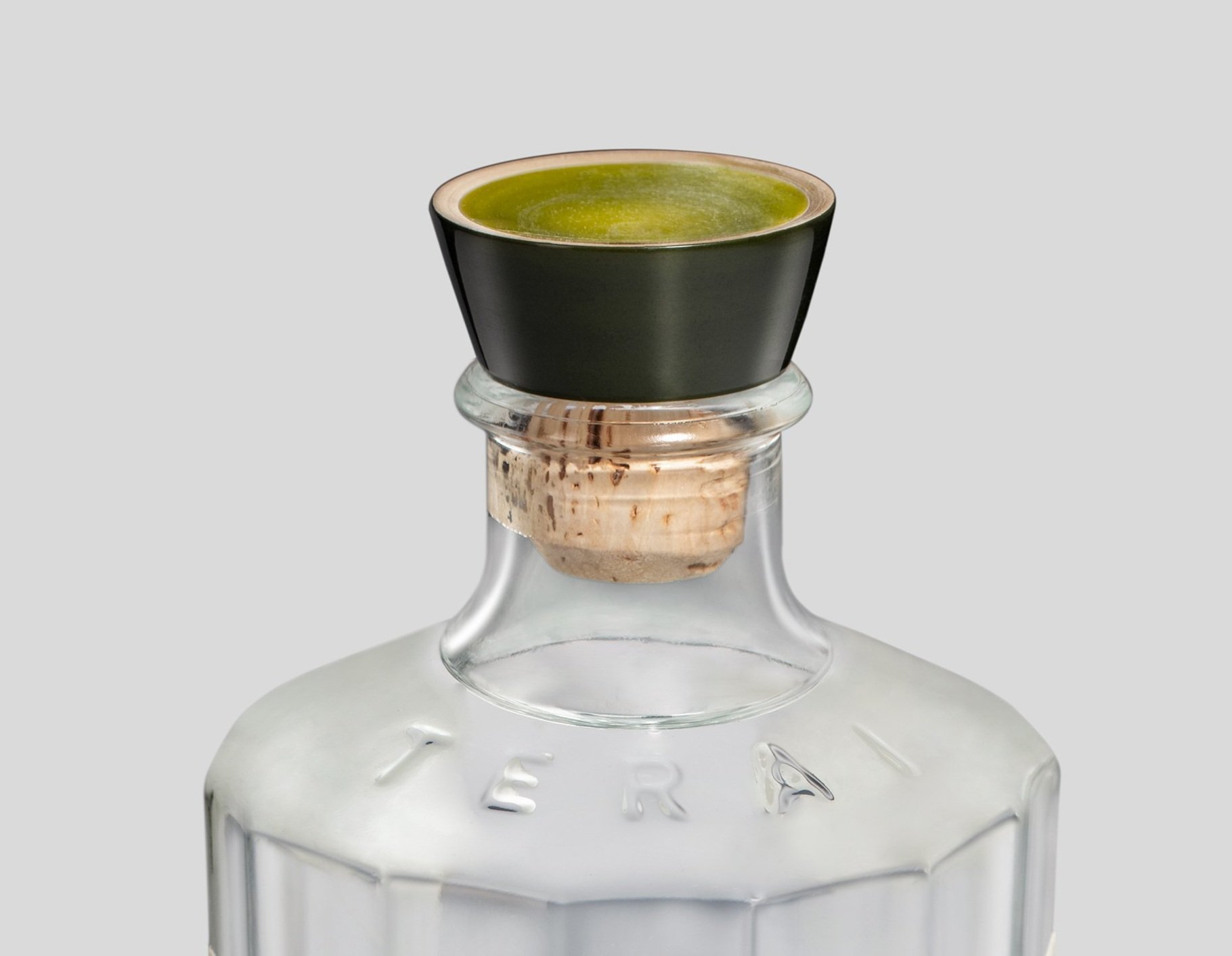
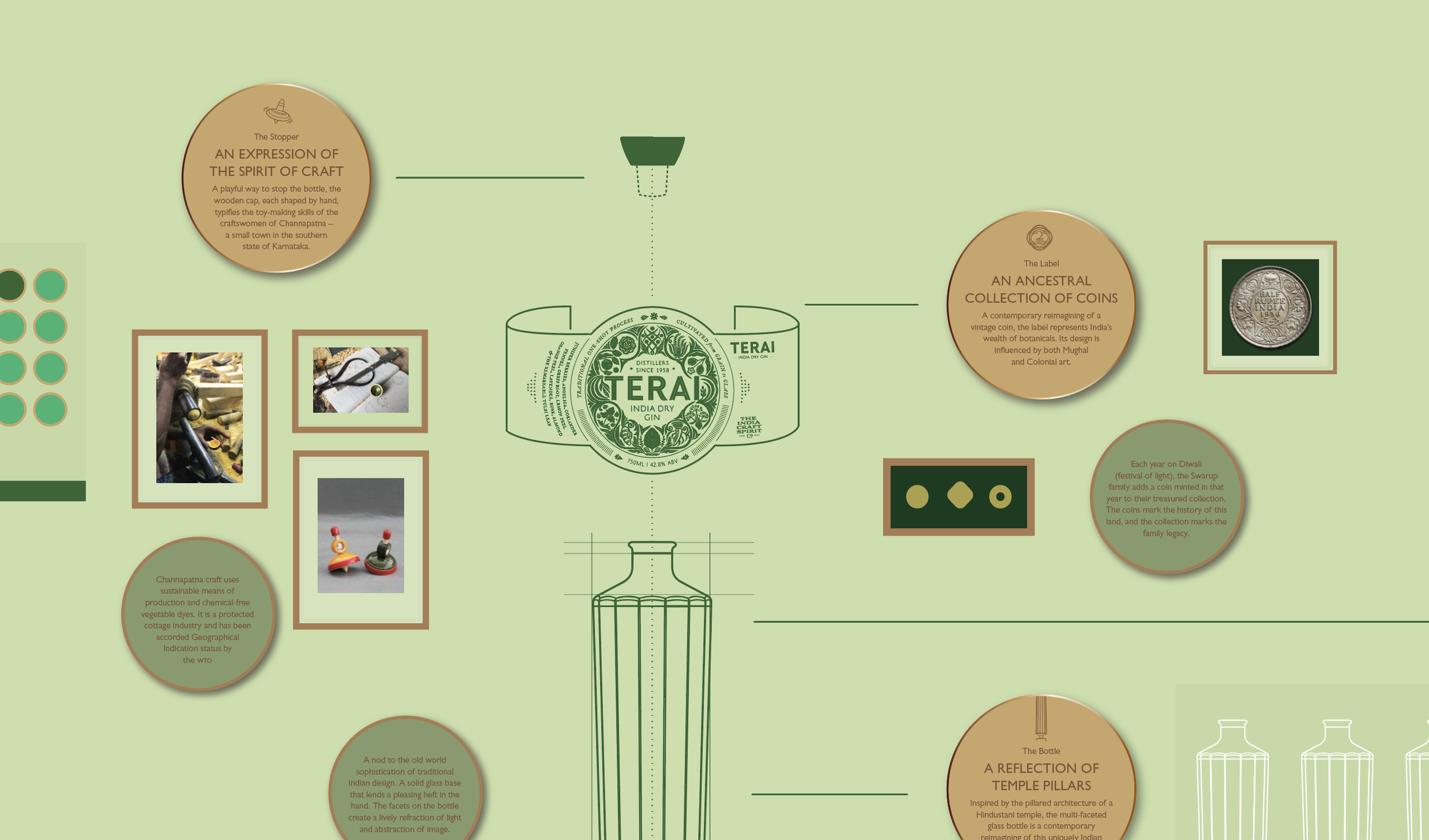
stopper DesignWhile developing the brand narrative for Terai, we wrote story ideas, sketched label shapes and elements, drew bottles and closures and explored material palettes all at once.
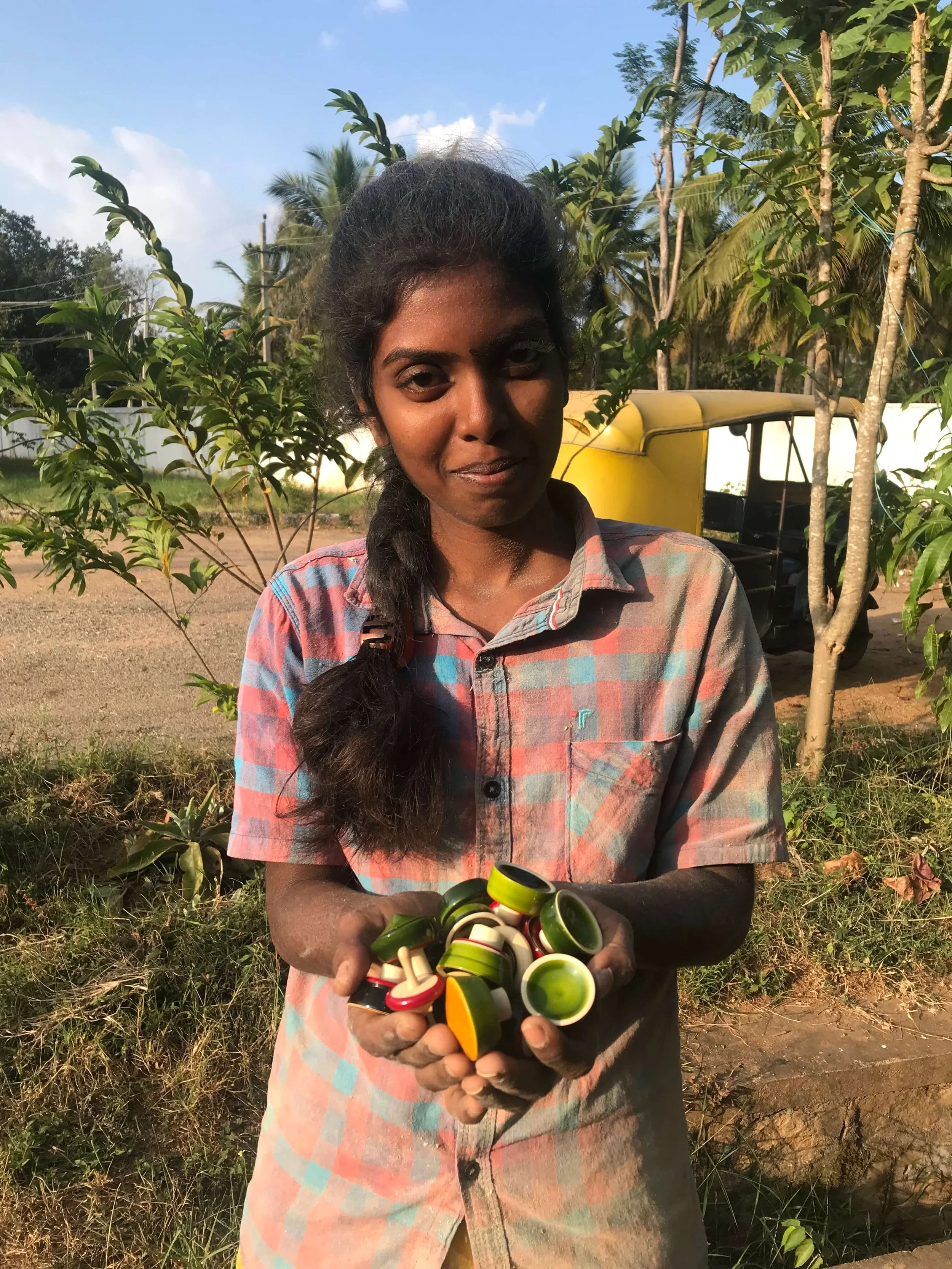
Our search for the right Terai bottle stopper took us to India's beloved ‘toy town’ Channapatna. Over memorable days of trials, permutations, language-barrier-giggles but also truly amazing collaborative energy with our ally Pooja, we had our perfect design. The Terai stopper has been carefully carved, coated and buffed to a shine by hand in this little dusty hamlet with a huge heart. The ivory wood is backyard-grown, seasoned, hand-carved on simple lathes. Natural tree-sap lacquer mixed with vegetable dyes is used to coat the piece as it spins, a process ever-mesmerising to watch.


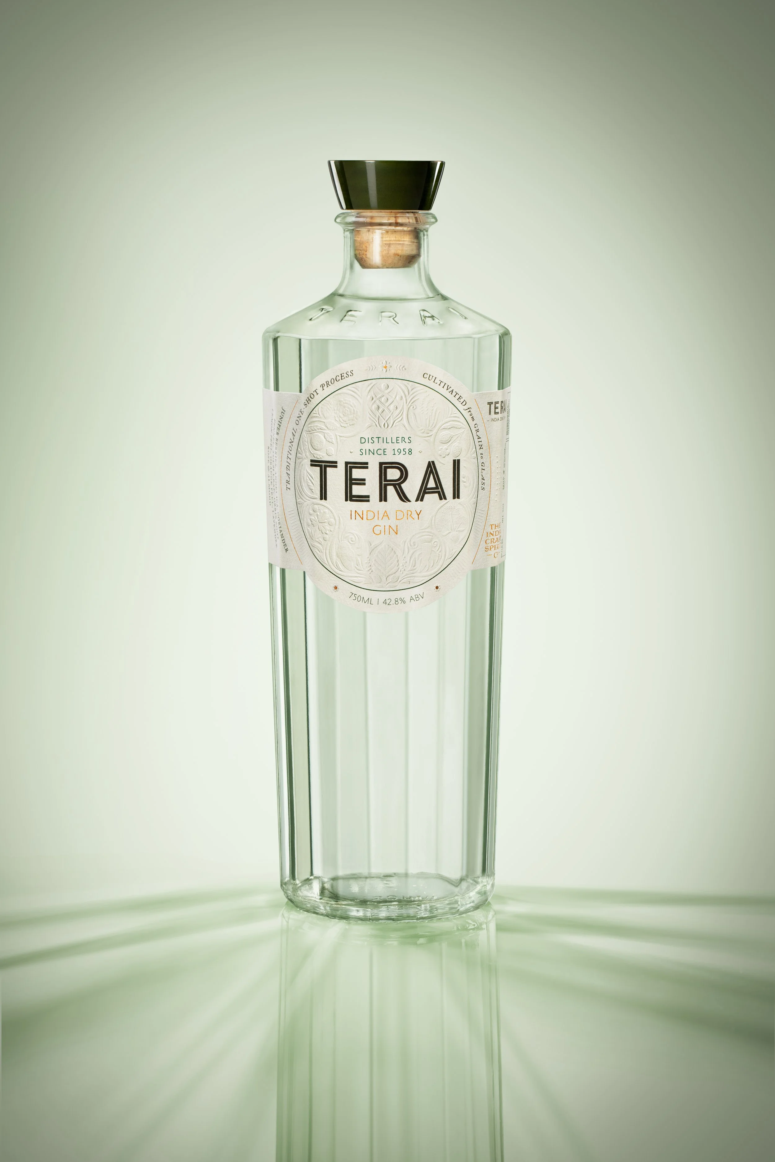
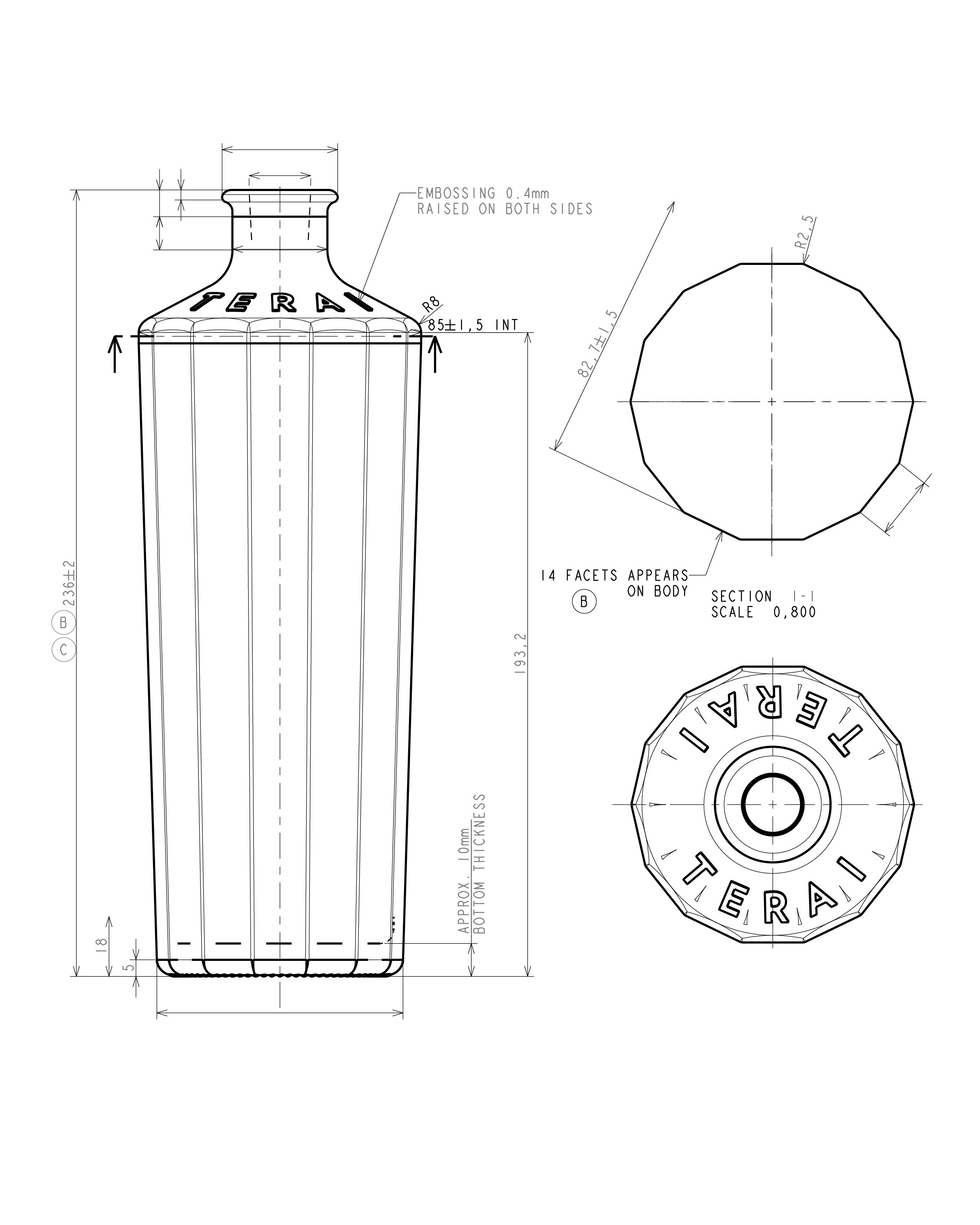
Bottle DesignTerai was conceived as a confident, modern, global brand with a strong, deeply rooted, authentic Indian spirit, and the bottle would be the primary touchpoint to express this. Amongst our sketches, a tall, faceted design inspired by hand-carved pillars in ancient Indian architecture and products, was selected for development. Along with Shekhar Swarup and his highly technically experienced team, the shape, dimensions, proportions of the lip, shoulder, body and base were refined and tested over months, achieving the right form, ergonomics and fabrication details.


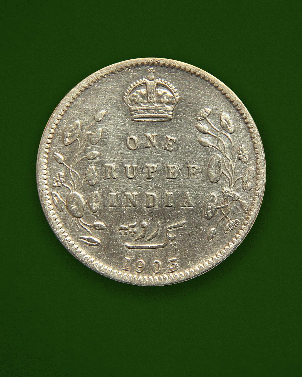
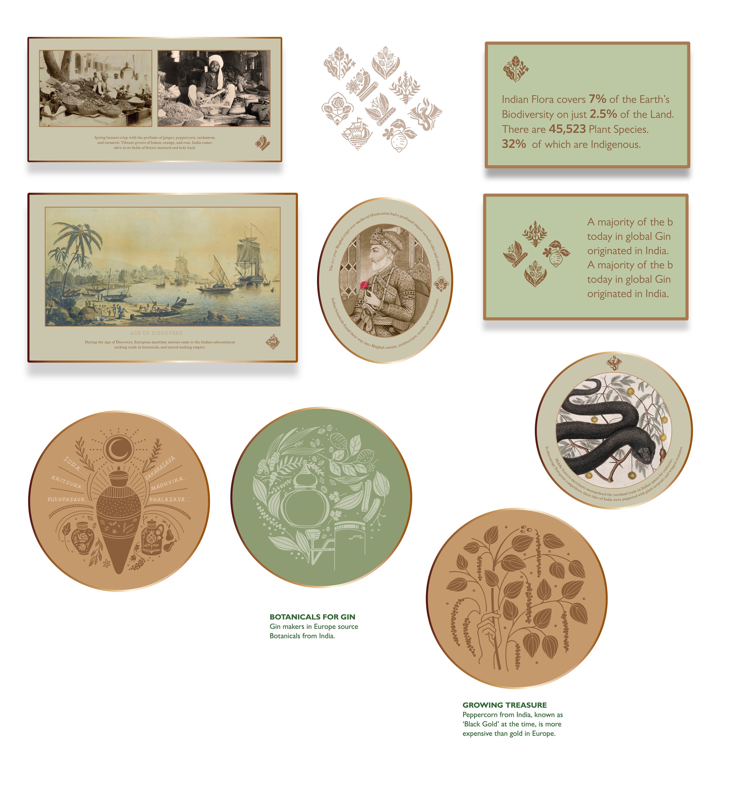
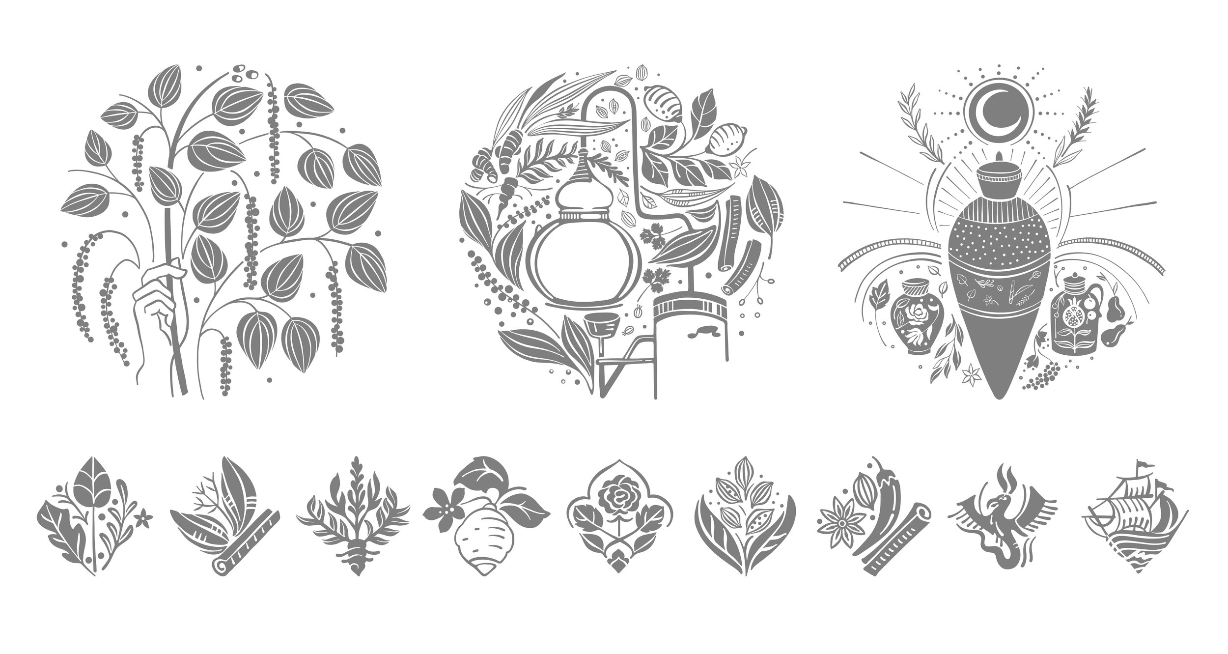
illustrationsLearning about gin production from the incredible Terai family and distillers, we dived deeper into the world of botanicals— their fascinating Indian histories and symbolism, flavour notes when distilled, the process of tasting, testing, getting them to balance just right. A very special set of vintage Indian coins that we stumbled upon in the Swarup family’s collection, became the inspiration for an illustration of our botanicals. These coins minted in early independent India have a unique visual style, symbolic of Indian pluralism itself. While the overall arrangement, form and typography is quite English, the chunky, bold motifs themselves are reminiscent of Mughal-era paintings, hinting at a collaboration of local painters and Colonial designers of the time. The Terai botanicals have been visually interpreted in a similar way, a hat-tip to that era. They were researched, drawn carefully by hand, then converted with specialised craftsmen to a fine sculptural emboss on the Terai label.


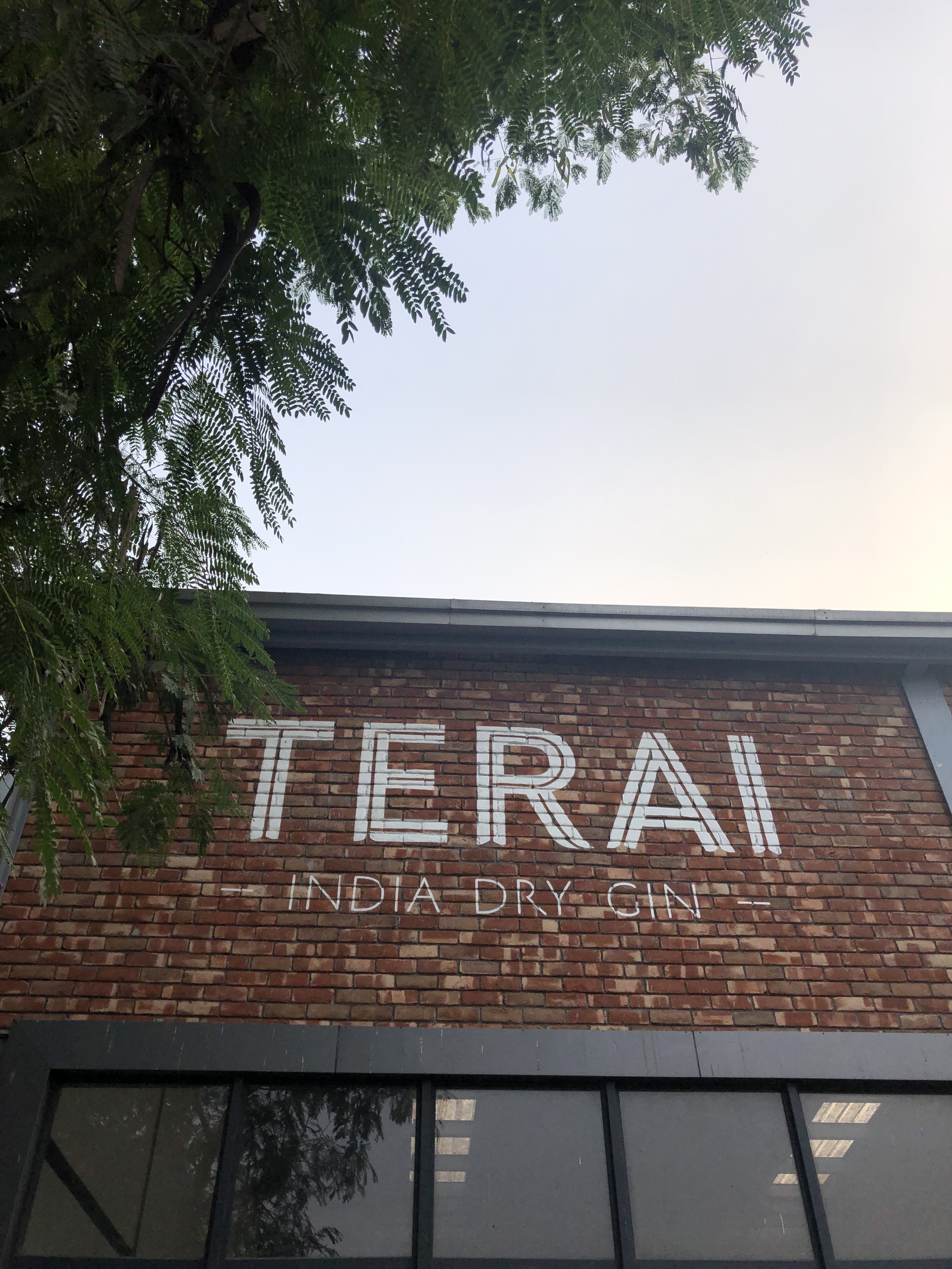
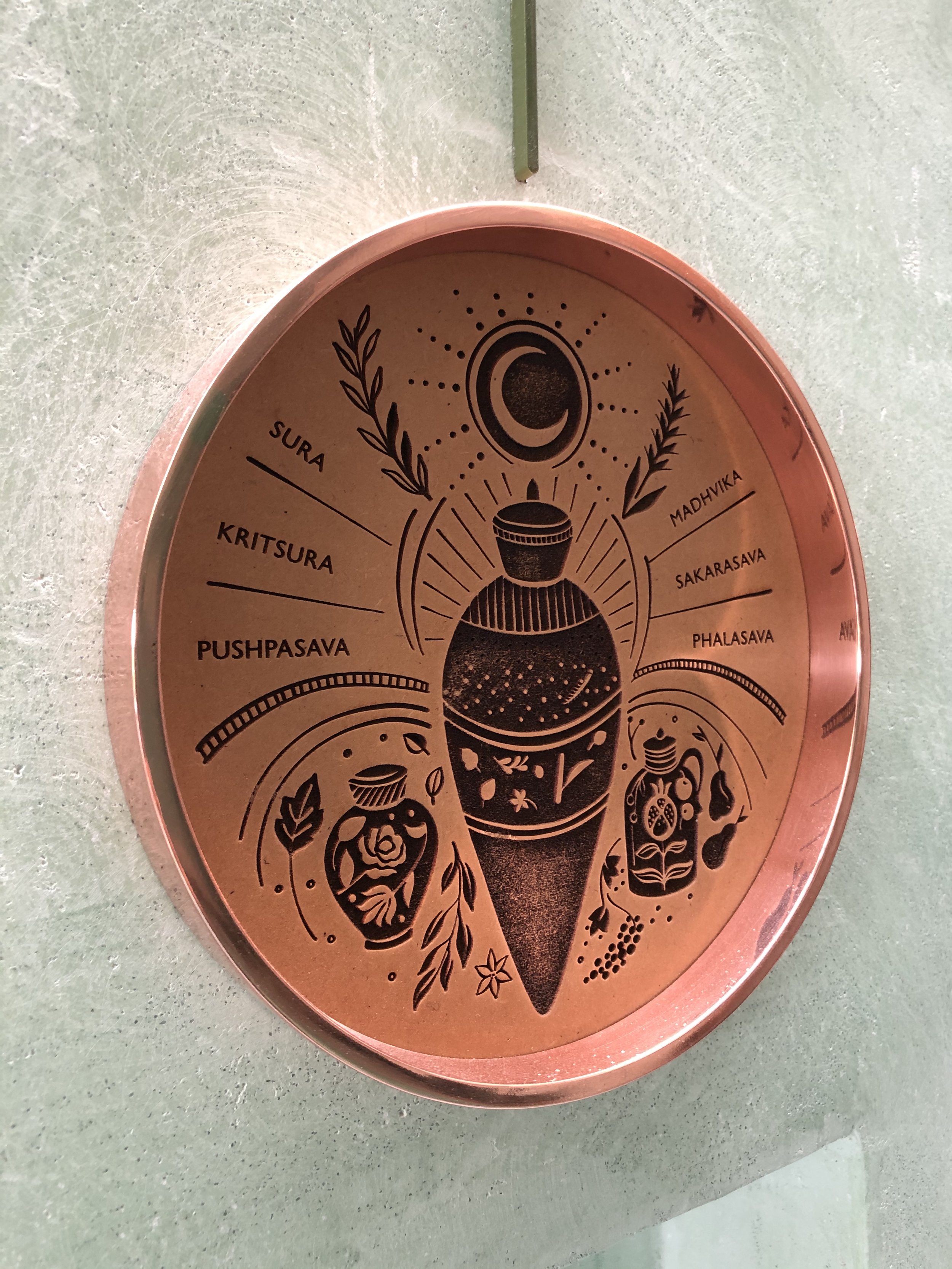
Distillery experience & signage DesignWe planned the narrative, visual language and installations for the distillery experience, then helped bring them to life. From illustrations etched into wooden panels and framed in copper, to custom hand-embroidered and hand-painted murals, to brass-cast botanicals and customised poetry.


Client: Globus Spirits Pvt Ltd, 2018–20
Studio: Quick Brown Fox Design
Creative Strategy & Direction: Hanumant, Khanna, Kriti Monga
Project Management: Hanumant Khanna
Creative Copy: Arjun Nath
Design Team: Rohnit Rehani, Aayushi Katare, Divya Lohia, Aradhana Rawat, Shirish Ghatge
Collaborators: Oroon Das (Exhibition Design), Ashdeen Lilaowala (Embroidery), Shovan Gandhi (Photography)